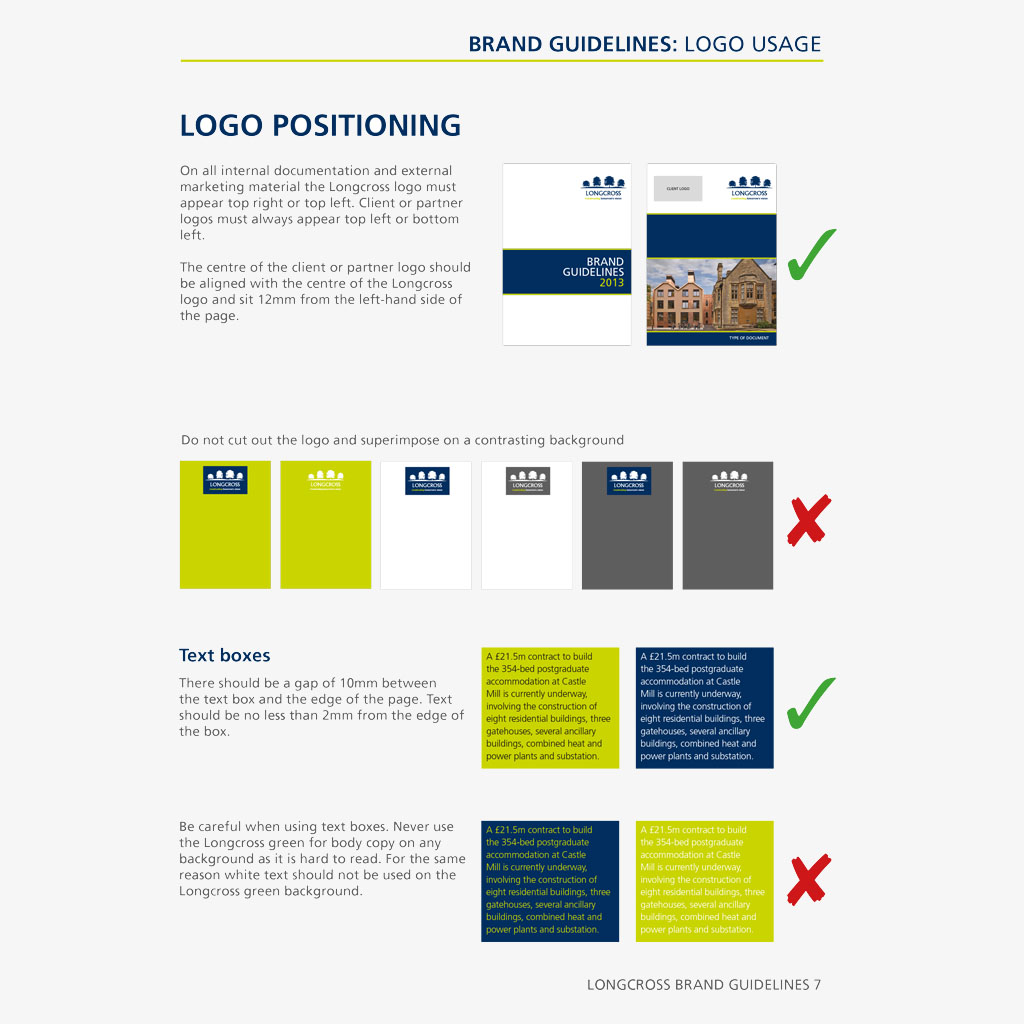
We often get asked about brand guidelines design so we’ve compiled a top 10 tips for producing better brand guidelines. A well-considered document will ensure the guidelines are effective at communicating your brand design and describing how to produce it consistently without killing the ability to be creative with it.
1. Who are the guidelines for?
Consider who is going to be receiving, reading and using these guidelines and tailor the content accordingly. Write with language to engage that audience. Steer clear of jargon and try not to assume technical knowledge if it is going out to all levels within the company. Consider the benefits of multiple versions of guidelines; a technical production reference, a quick guide one sheet for logo and colour use, more in-depth guidelines including brand personality, tone of voice, etc.
2. Keep it simple
We appreciate that this is easier said than done but if you want your brand guidelines design to be embraced by all then you need to ensure that what you are explaining is easily understood. The extra time it takes to consider how to simplify the use of your brand now will save a lot more time in future; time that would be spent amending the guidelines retrospectively to verify what you meant originally.
3. Design the guidelines in your brand style
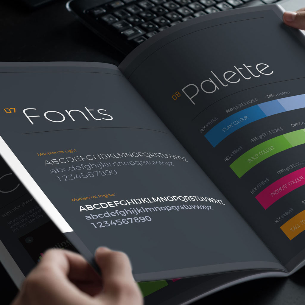
Make sure the document you are producing is truly representative of your business and embracing your brand. If your brand identity is a quirky, young, energetic feeling then make sure your guidelines aren’t stuffy.
4. Show clear examples of your brand in use
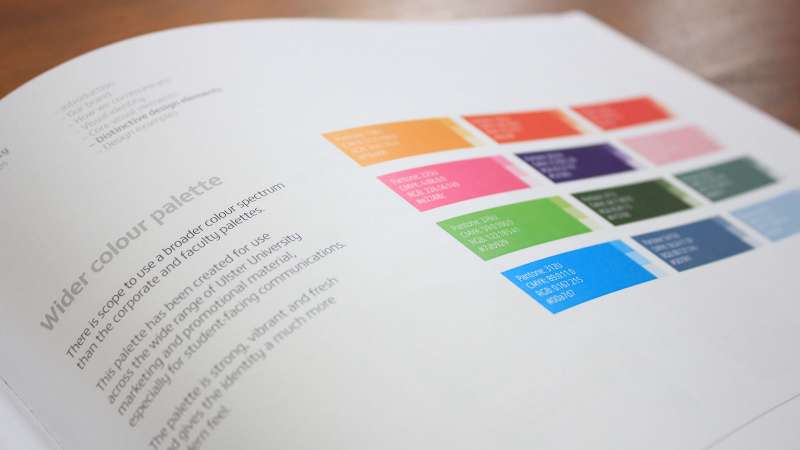
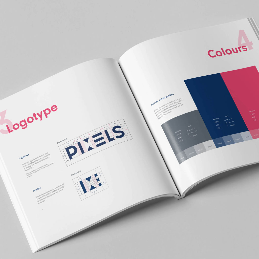
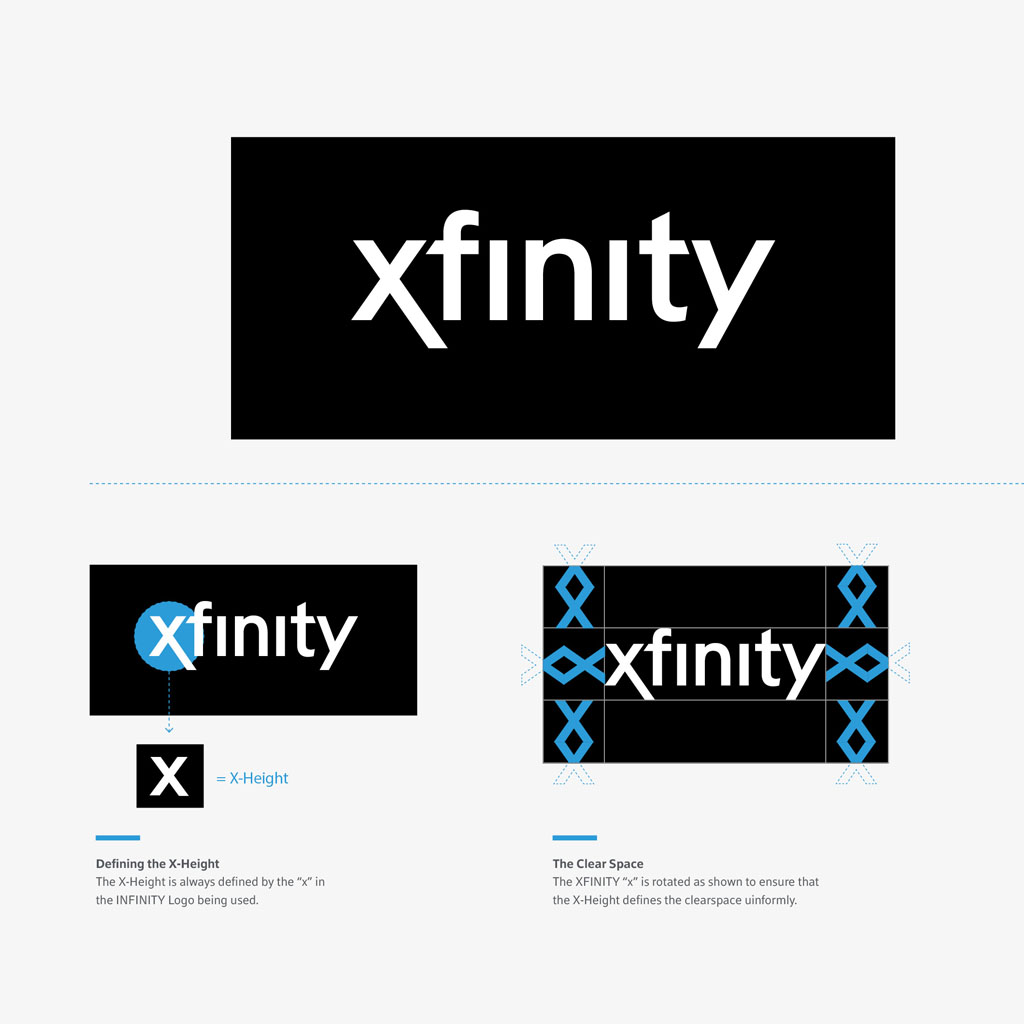
This tip is often surprisingly overlooked in many brand guidelines documents we see. How better to explain how to use your brand than to show it in various real-life examples as you intended.
5. Consistency
Make sure when explaining your brand that it is consistent in how it recommends use of your company’s brand. If you are contradicting yourself every other page then what hope will the reader have of understanding how they are supposed to use your brand.
6. Keep tracks of where your brand is used
This tip is more specific to the visual identity aspect of your brand but worth including in your brand guidelines design. If there are ever any changes to your logo, colours, font, etc. you need to be able to track back wherever the previous version has been used so that you can replace with the updated version. Examples could include stationery, website, intranet, aggregator sites, affiliate marketing, social networks, email footers, presentations, document templates, signage, etc.
7. Make your materials available
The number one reason we see for inconsistent use of a brand identity is down to staff hoarding out-of-date materials and not having access to a library of correct files. Eliminate this issue by setting up a download section on your website where all logos, current guidelines, imagery, etc. are stored and are easily available to all. Make it password protected if you must but trust us, it’s a lot easier to update one set of logos online compared to replying to hundreds of individual emails requesting these marketing materials from various people in your company.
8. Involve your staff
If you want your staff to embrace your new brand then they need to truly feel like it is theirs. They need to understand why and how you have developed their brand and they need to understand how to use it going forward. Form a project team consisting of staff from all levels within your company who might encounter the guidelines and get regular feedback from them during guidelines development. Do they understand the document? What improvements do they suggest would help with the guidelines? What can you do as a company that will make it easier for your staff to use the brand? Involving your people on the ground and getting their feedback can throw up some great issues that would never have been appreciated within the marketing department alone.
9. Have a sign-off process
Assign a brand manager within the company who has been involved with the brand development process and understands your brand inside out. Stipulate that all new creative should be approved by this person and give them a 48 hour turn around period to allow this. This is especially important in the early days of a new brand while staff and external agencies are still getting to grips with any new styles. By doing this you will be able to ensure that you are delivering a consistent and correctly applied brand message to all communications leaving your company.
10. Review your guidelines regularly
The aim of guidelines is to explain, advise and guide use and reproduction of your brand. That doesn’t mean that your brand is set in stone from now to eternity. Your brand will continue to evolve and the brand guidelines design should be revisited and updated continually and then made available to all again. And to this end, make sure you include version numbers and not just on the front page. Ensure you include the document version number on every page in case the document ends up getting split and passed around internally which invariably it does.
So, to recap:
Who are the guidelines for?
Write them accordingly
Keep it simple to understand
Design the guidelines in your brand style
Show clear examples of your brand in use
Keep your instructions consistent
Keep tracks of where your brand is used
Make your materials available
Involve your staff
Have a sign off process
Review your guidelines regularly
There is just one more thing… Involve the professionals early on
We really recommend consulting us or another professional branding service to help with your brand guidelines design. The same issues come up again and again and we know what to look out for and how to avoid certain pitfalls with preemptive planning and briefing which will ensure your branding project runs smoothly and successfully.
