2018 has been an eye-catching year for stunning new logo designs, with many adapting new design trends, resulting in the creation of many new amazing brand identities. Unfortunately, we can’t discuss all the logo trends in 2018 as there are so many, but we can expand on some of the design disciplines and trends that were adopted this year.
We’ve selected 4 designs from each new trend and showcased them below.
Of course, design is subjective and you may think of other great designs launched this year, but the following logo trends in 2018 are what attracted us!
Enjoy!
#1 Tumbled logos.
Over-amplifying & over-easing the effect of rounded corners.
#2 Parallelogram logos.
Solutions that signal “up and to the right”, often with the shape of a rectangle (parallelogram).
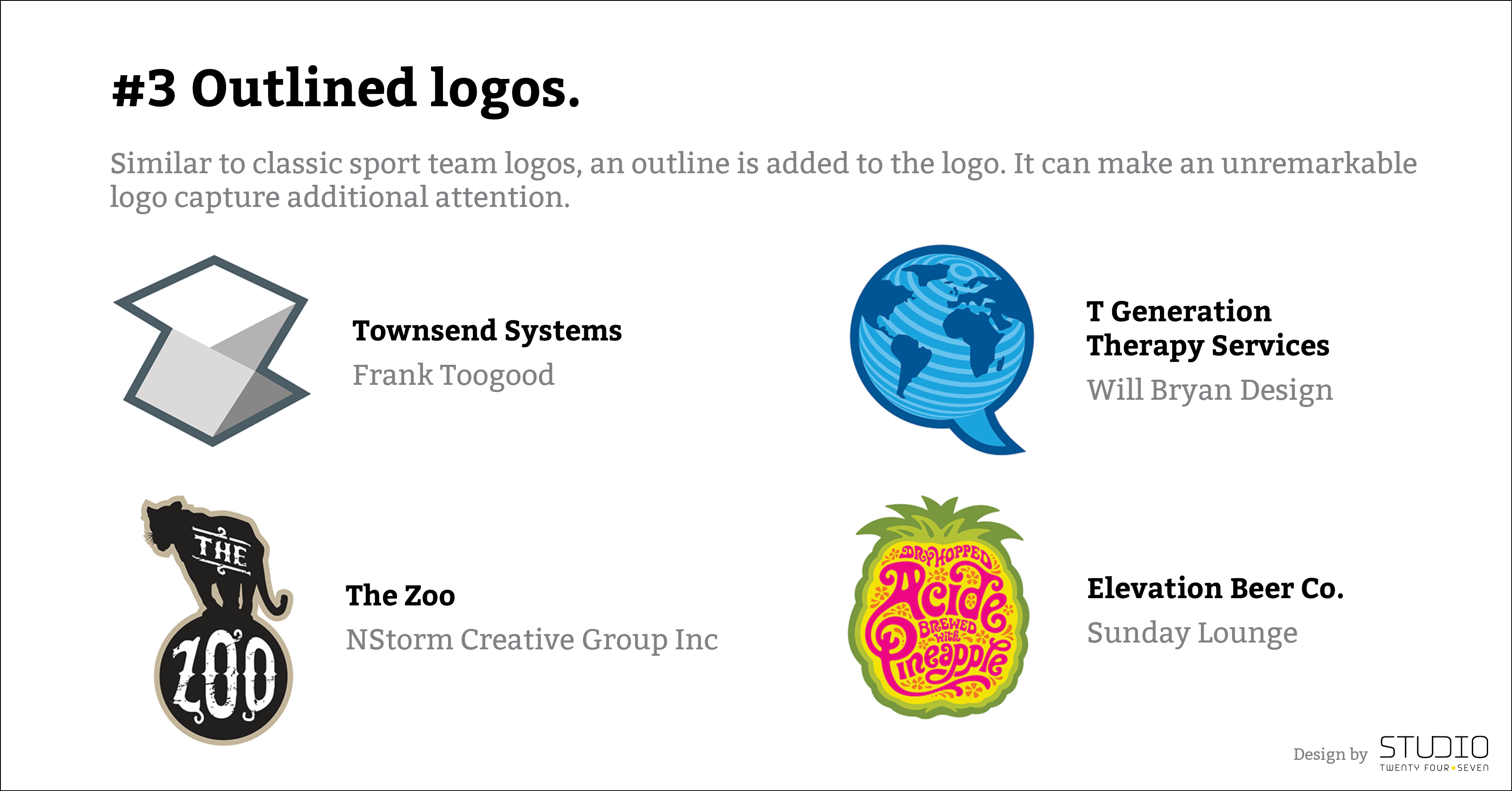
#3 Outlined logos.
Similar to classic sport team logos, an outline is added to the logo. It can make an unremarkable logo capture additional attention.
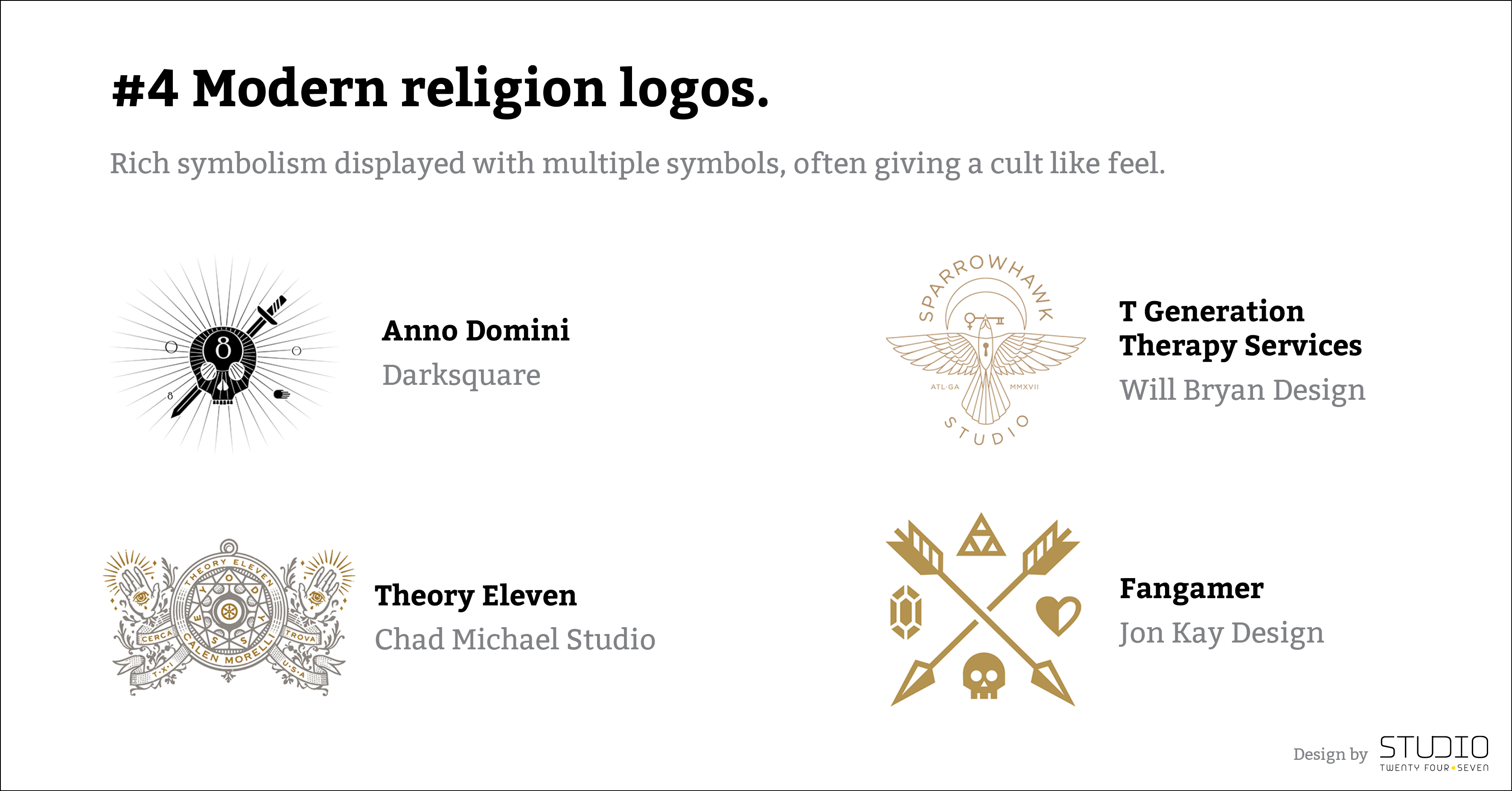
#4 Modern religion logos.
Rich symbolism displayed with multiple symbols, often giving a cult like feel.
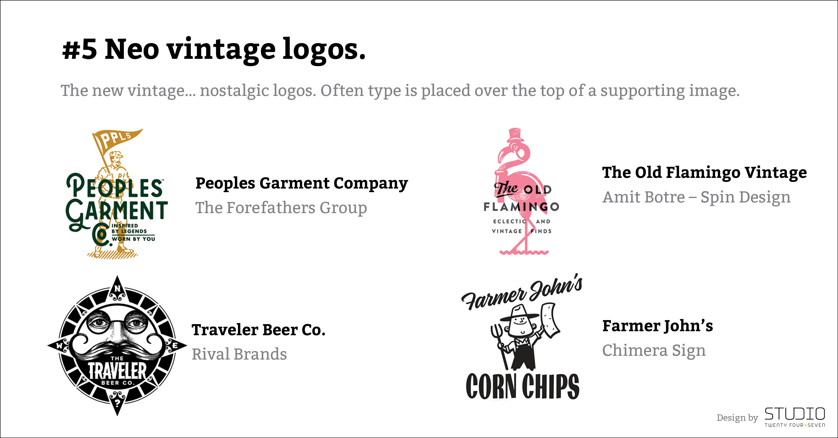
#5 Neo vintage logos.
The new vintage… nostalgic logos. Often type is placed over the top of a supporting image.
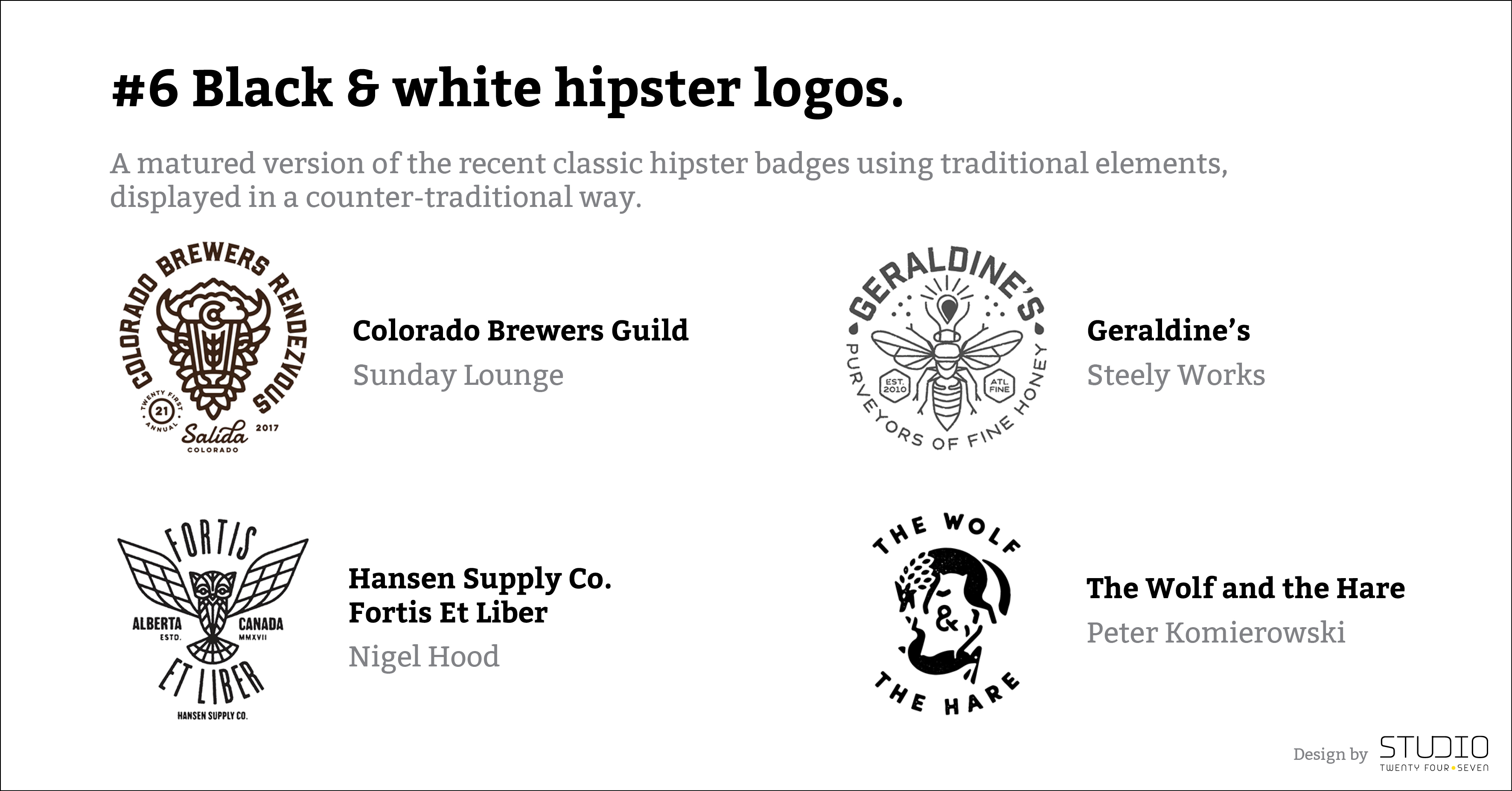
#6 Black & white hipster logos.
A matured version of the recent classic hipster badges using traditional elements, displayed in a counter-traditional way.
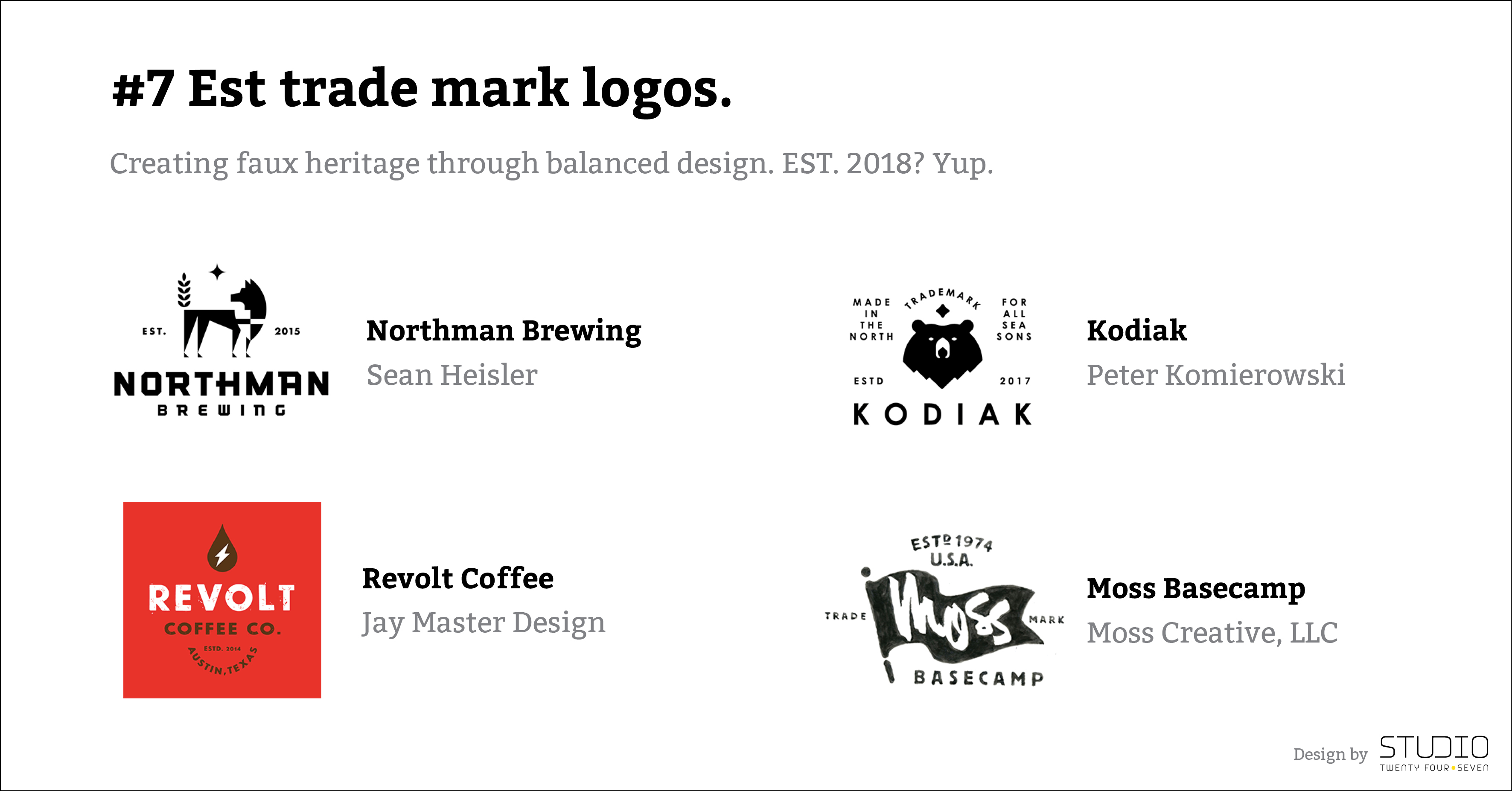
#7 Est trade mark logos.
Creating faux heritage through balanced design. EST. 2018? Yup.
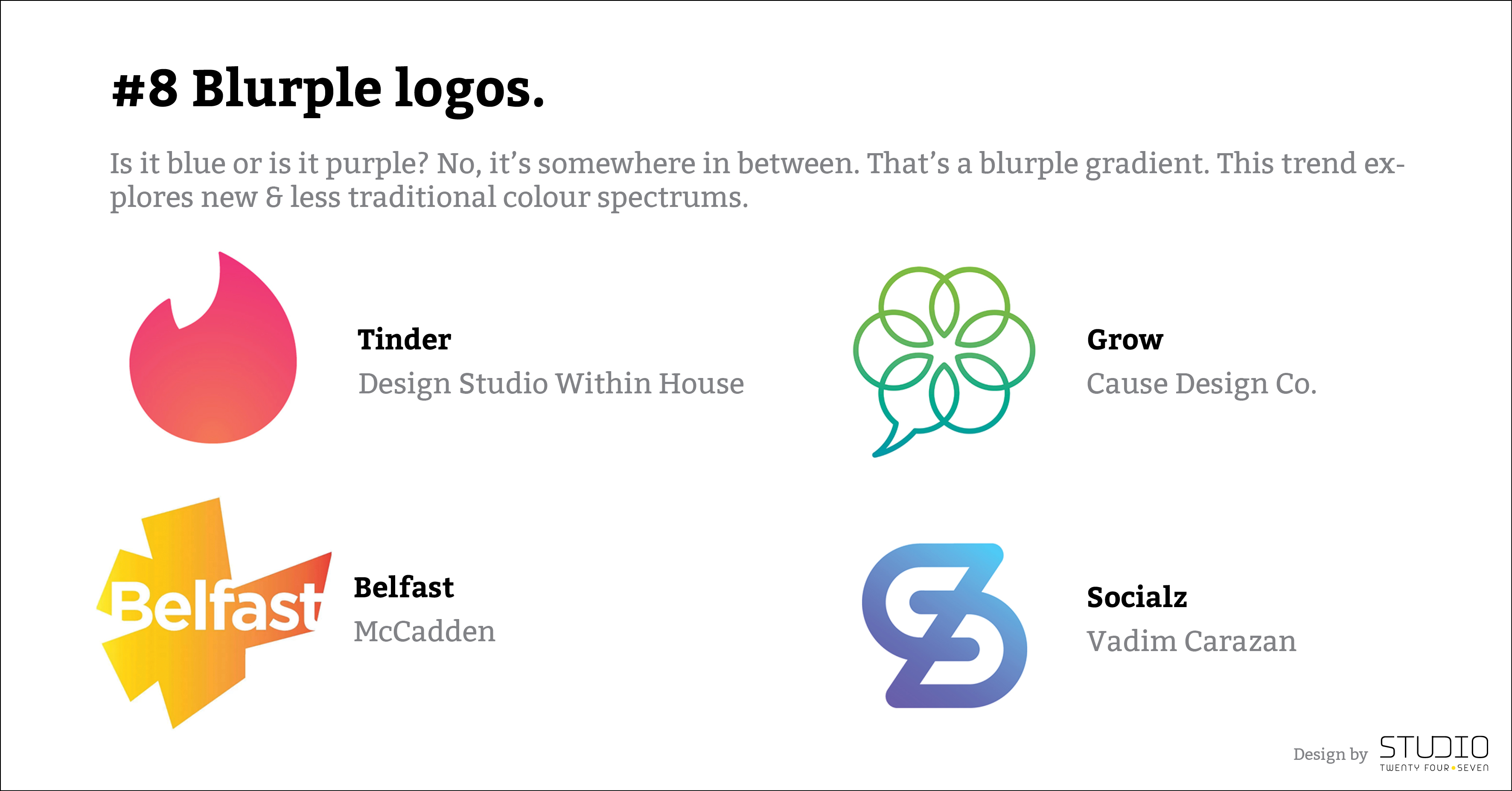
#8 Blurple logos.
Is it blue or is it purple? No, it’s somewhere in between. That’s a blurple gradient. This trend explores new & less traditional colour spectrums.
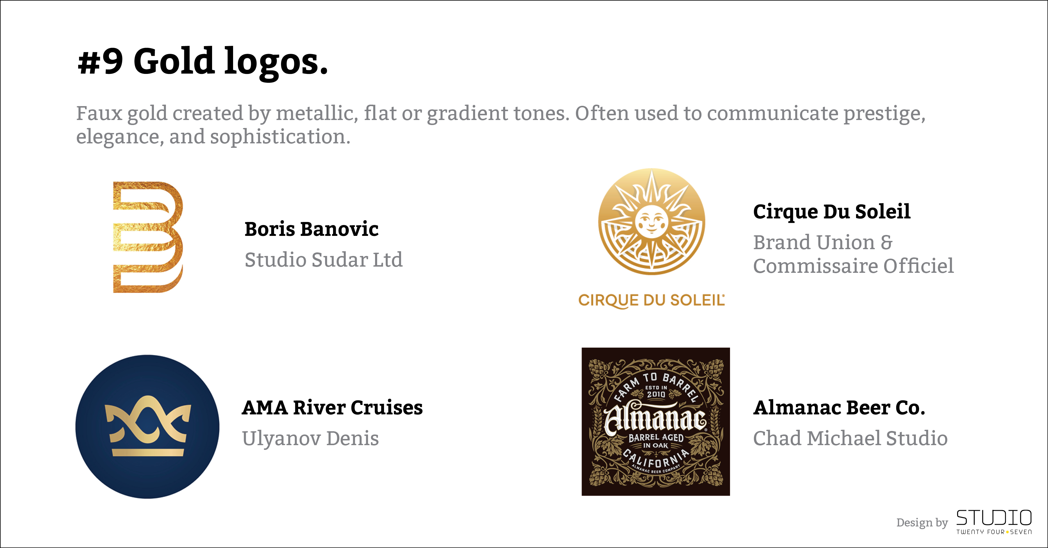
#9 Gold logos.
Faux gold created by metallic, flat or gradient tones. Often used to communicate prestige, elegance, and sophistication.
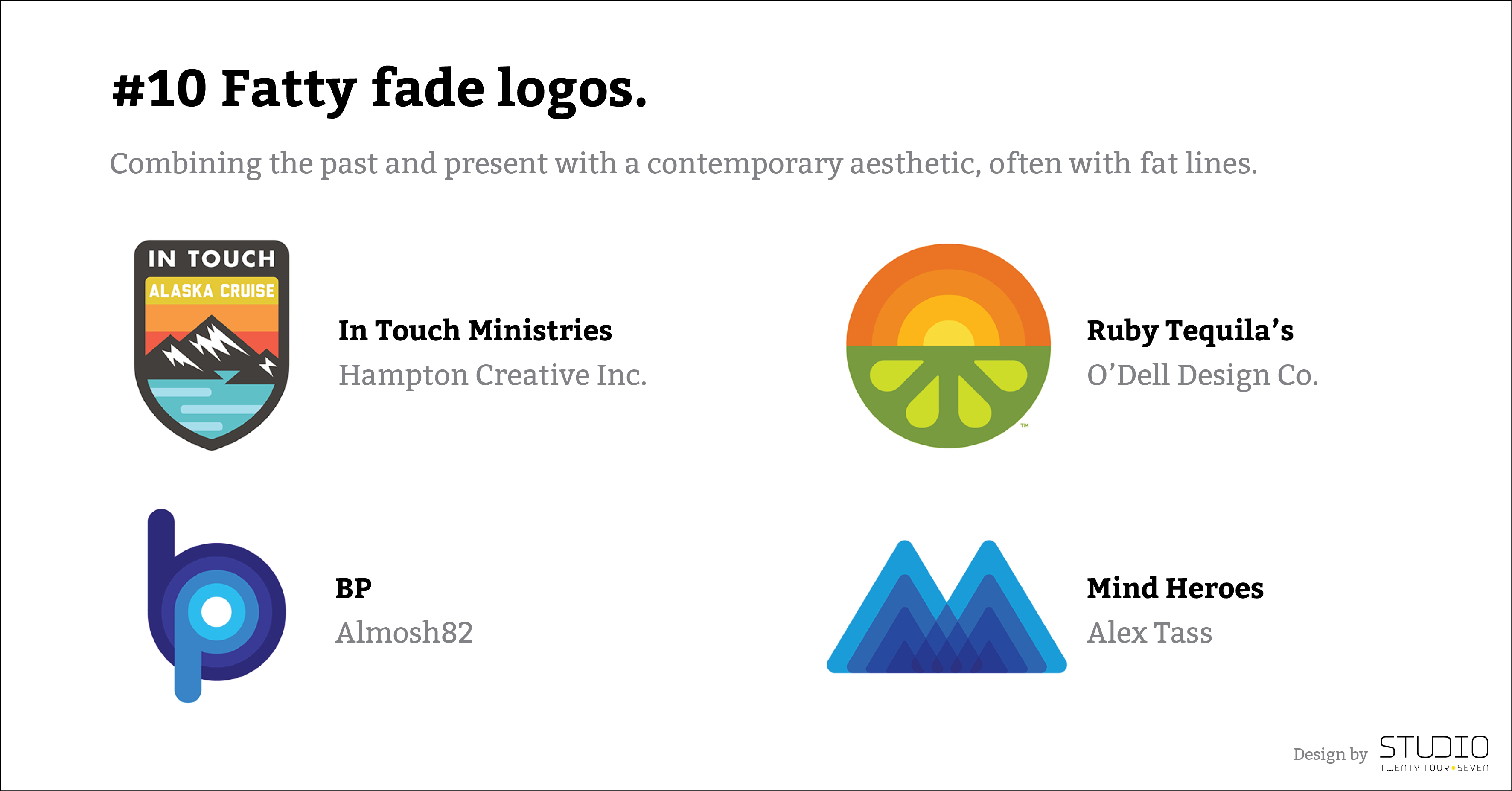
#10 Fatty fade logos.
Combining the past and present with a contemporary aesthetic, often with fat lines.
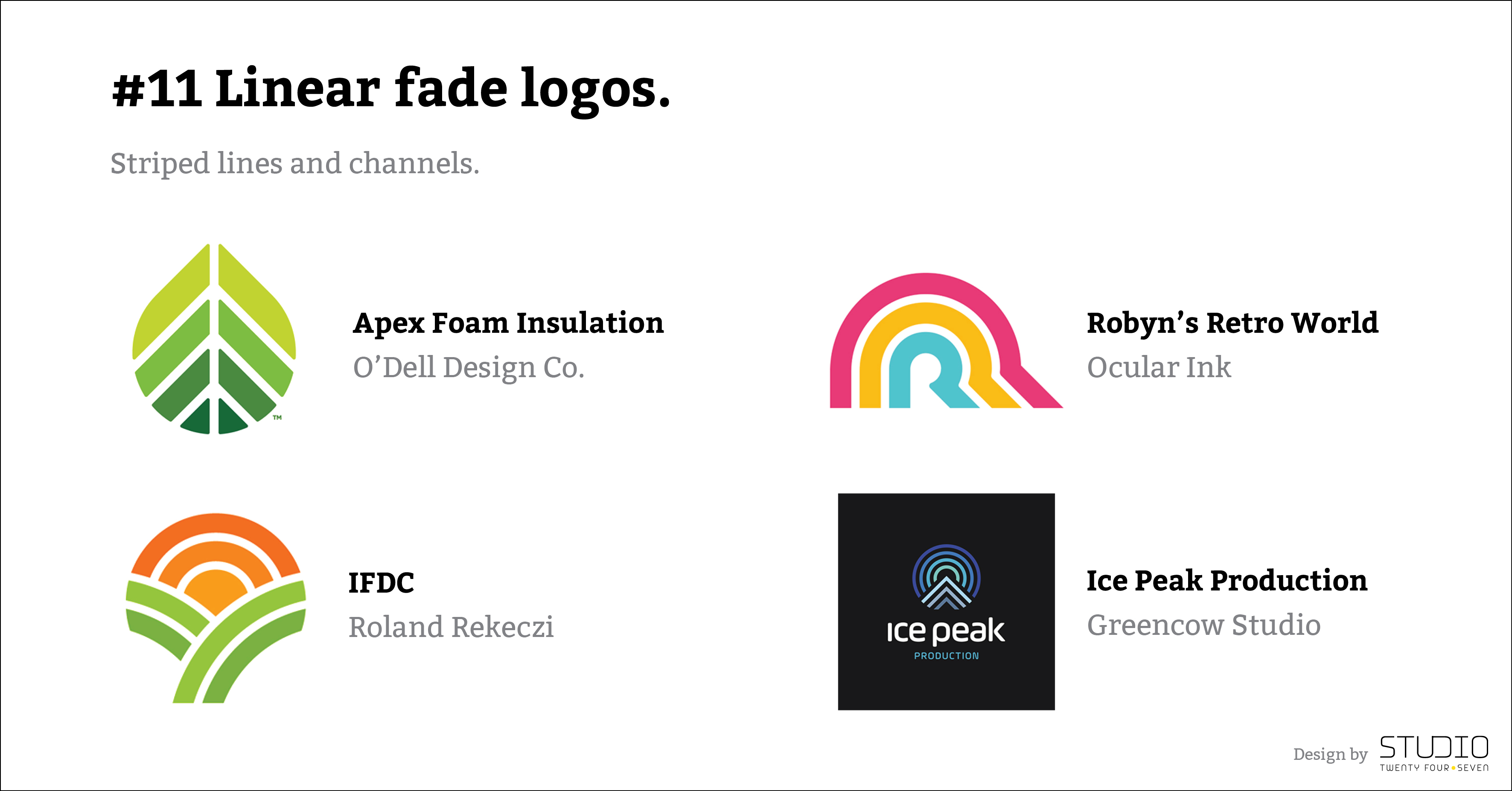
#11 Linear fade logos.
Striped lines and channels.
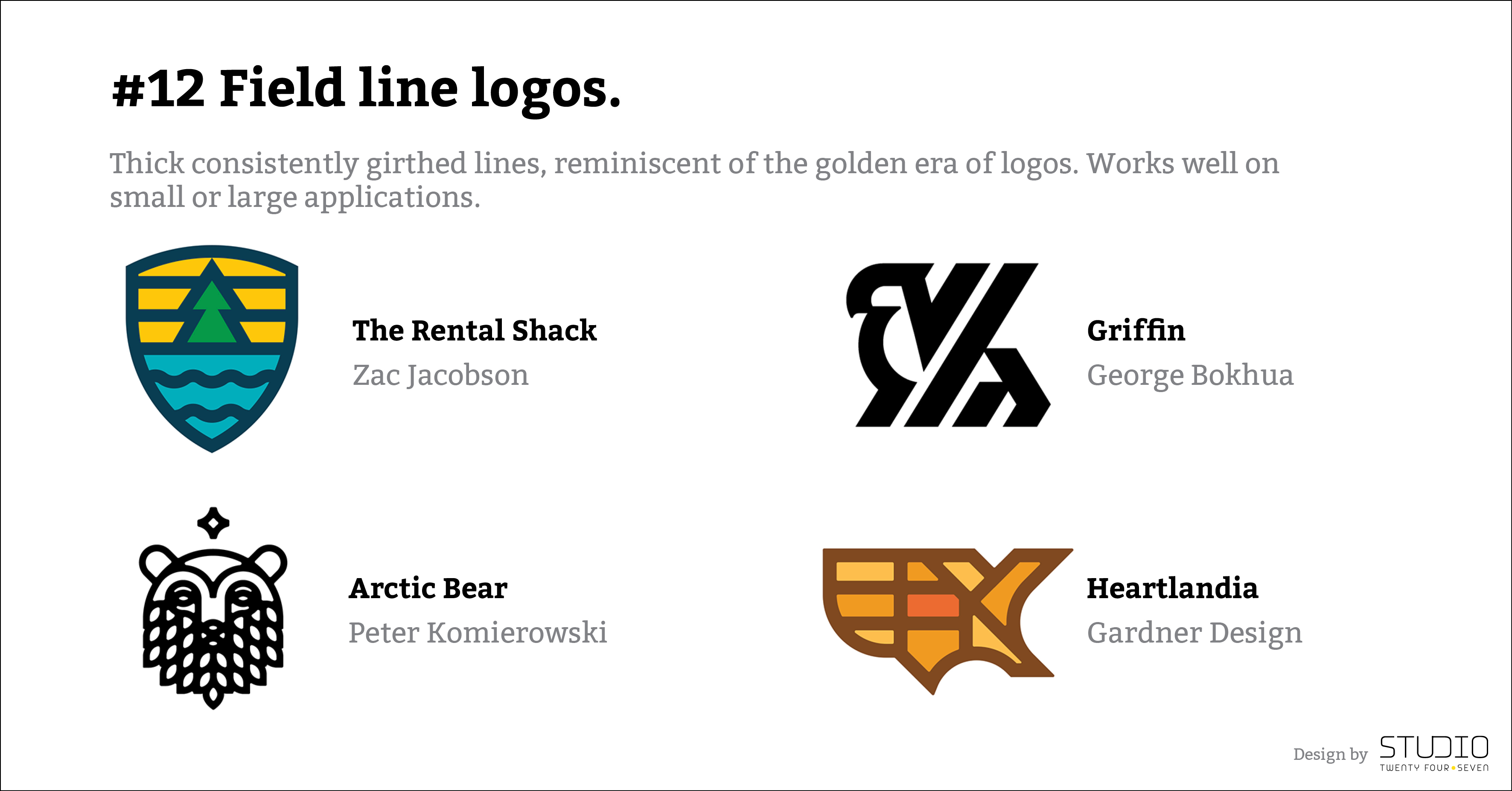
#12 Field line logos.
Thick consistently girth lines, reminiscent of the golden era of logos. Works well on small or large applications.
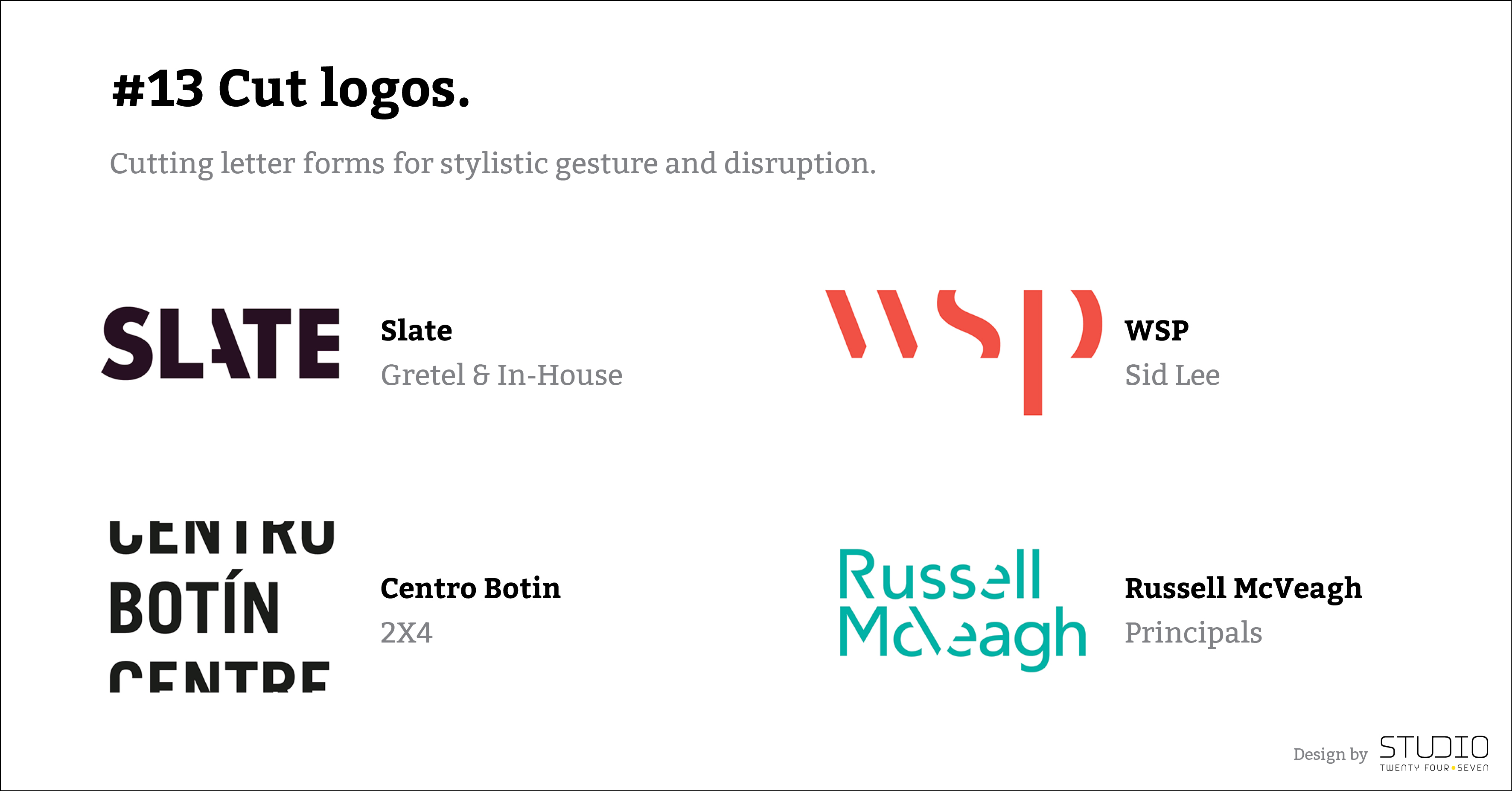
#13 Cut logos.
Cutting letter forms for stylistic gesture and disruption.
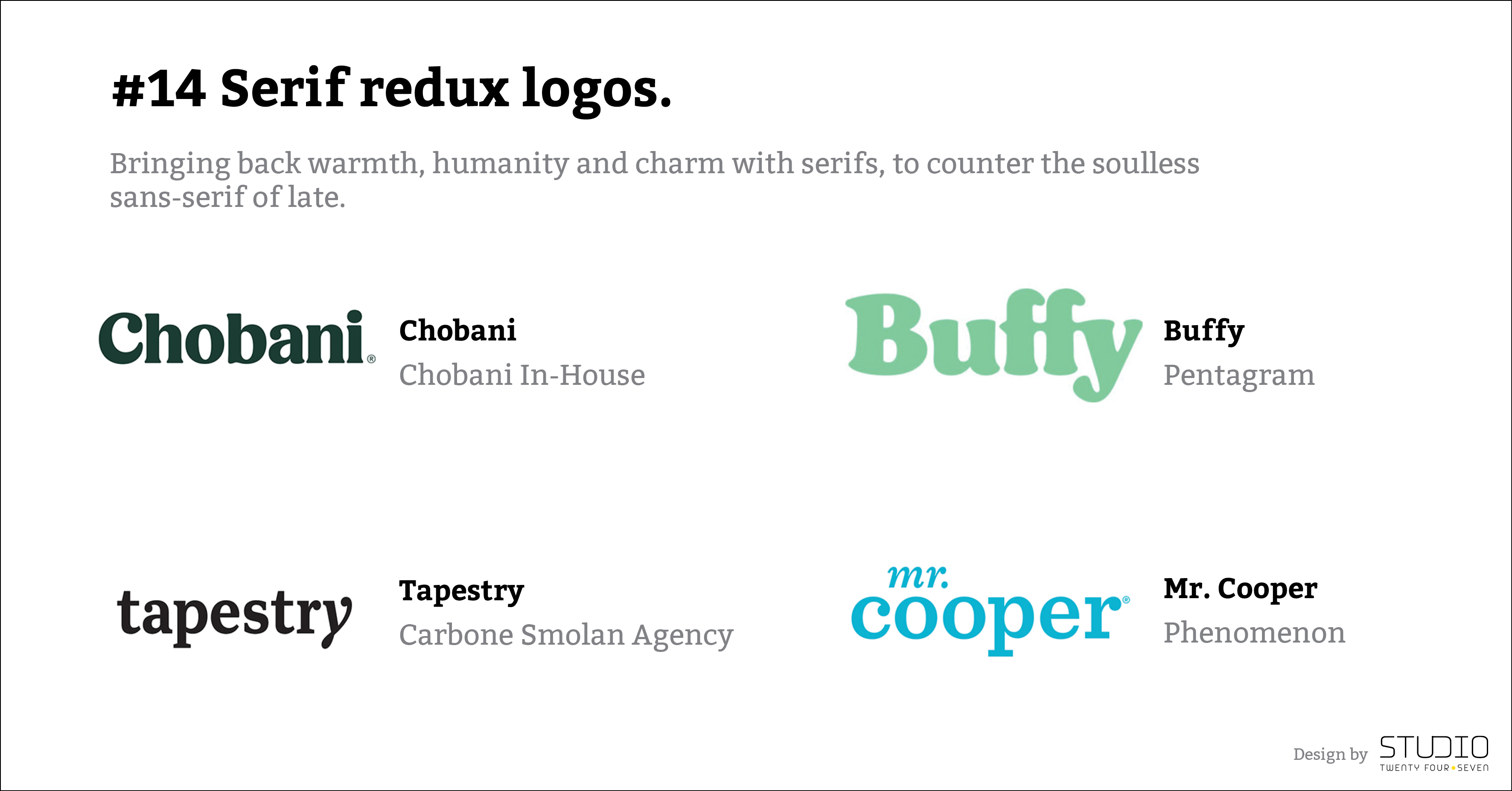
#14 Serif redux logos.
Bringing back warmth, humanity and charm with serifs, to counter the soulless sans-serif of late.
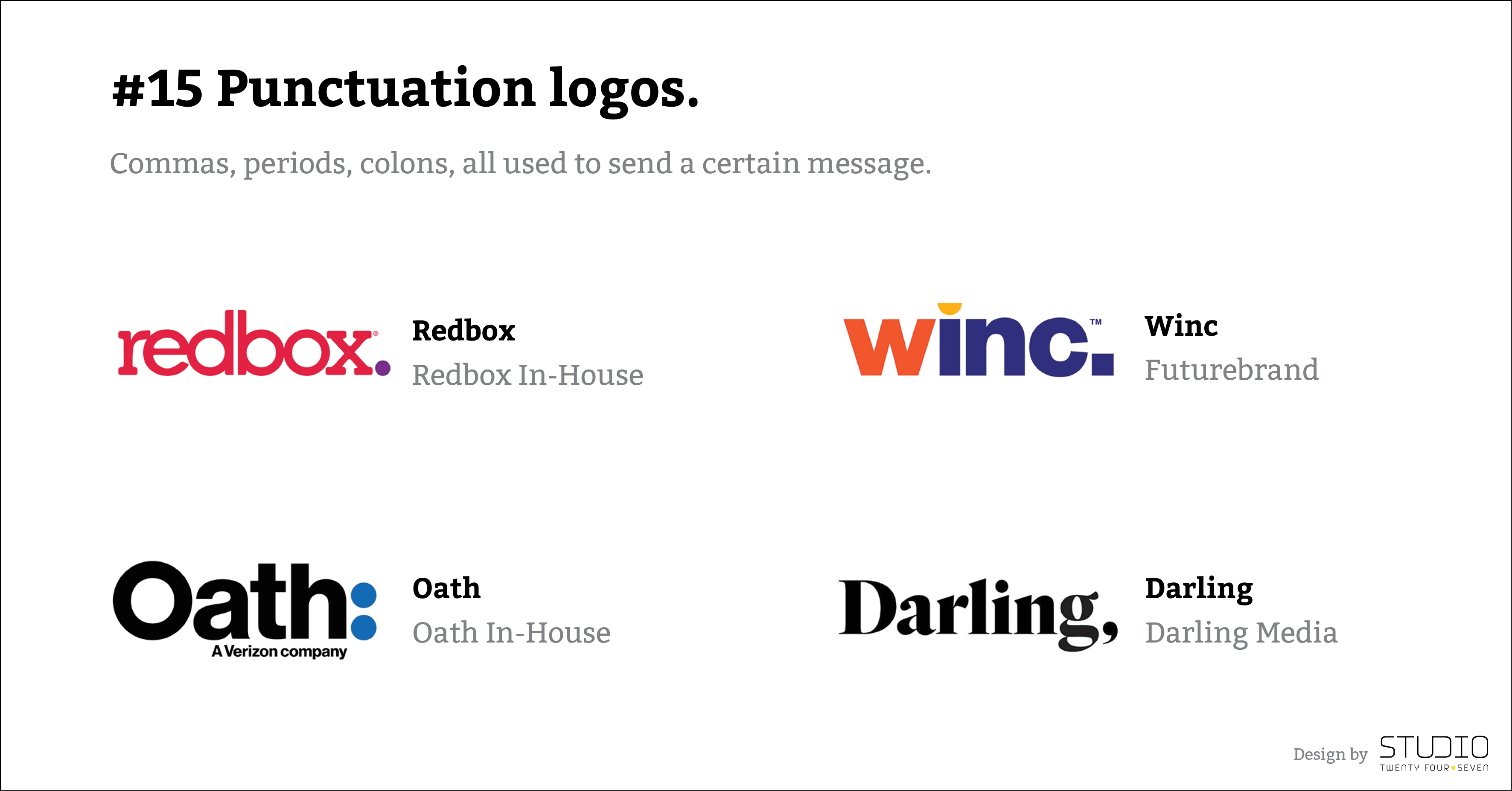
#15 Punctuation logos.
Commas, periods, colons, all used to send a certain message.
